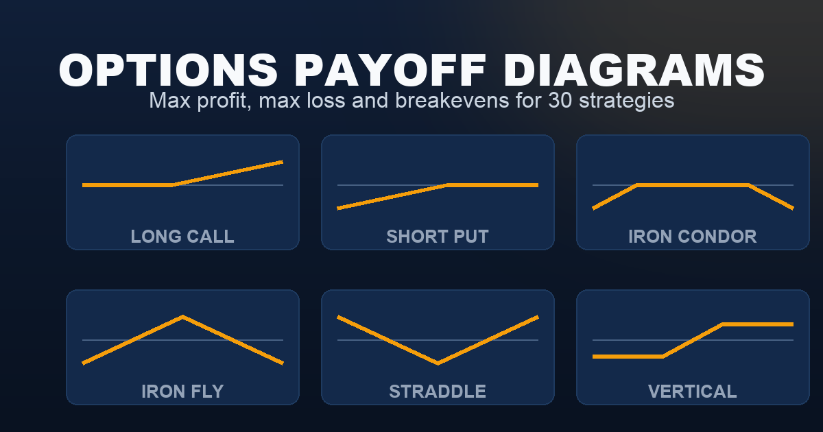
30-Second Summary
A payoff diagram plots what a position is worth at expiration against where the underlying finishes. The horizontal axis is price, the vertical axis is profit and loss, and the flat segments are the parts that matter most — a flat line means the outcome has stopped changing, which is either your max profit or your max loss. Below are all thirty strategies in the library, grouped by the market view they express, each with its max profit and max loss underneath. Click any diagram for the full setup, Greeks, and worked example.
How to Read a Payoff Diagram
Four features carry all the information:
- The zero line. Where the plotted line crosses it is a breakeven. Two crossings means two breakevens — one on each side — which is the norm for condors, flies, straddles and strangles.
- Flat segments. A horizontal line is a capped outcome. Flat on the left and sloping up on the right is a long call. Flat in the middle and sloping down on both ends is a short strangle.
- Kinks. Every bend sits at a strike. Count the kinks and you know how many legs the structure has.
- The open ends. A line that keeps rising or falling at the edge of the chart means unlimited — no long leg is capping it. That’s the single most important thing to check before opening a position.
One caveat worth stating plainly: these charts show expiration values. A position rarely behaves like its payoff diagram before then, because extrinsic value is still in the price. An iron condor sitting comfortably inside its range three hours before the close is not yet at max profit — theta still has work to do, and gamma can undo it. The diagram is the destination, not the route.
Payoff Diagrams by Market Outlook
Bullish Strategies
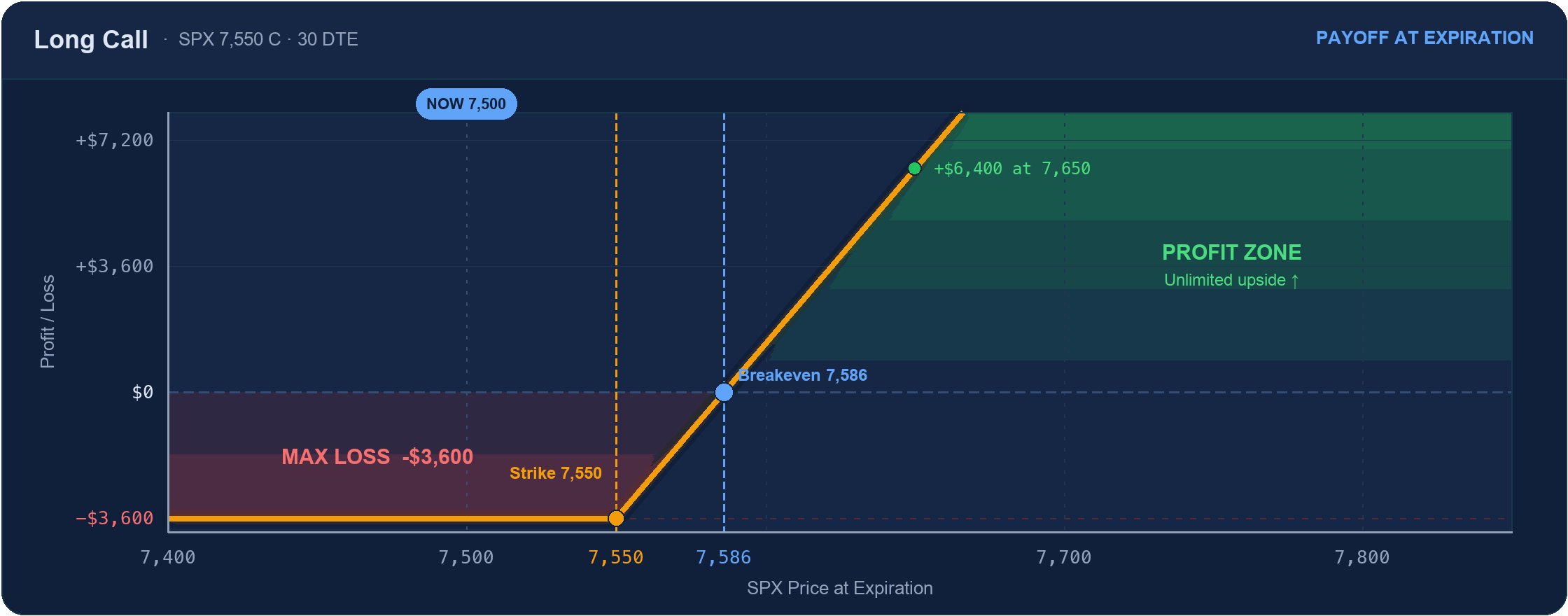
Max loss: Premium paid ($3,600)
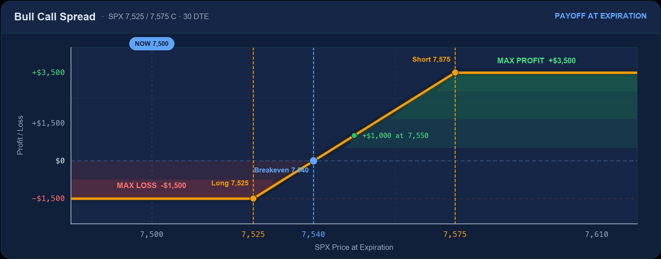
Max loss: −$1,500 (the debit)
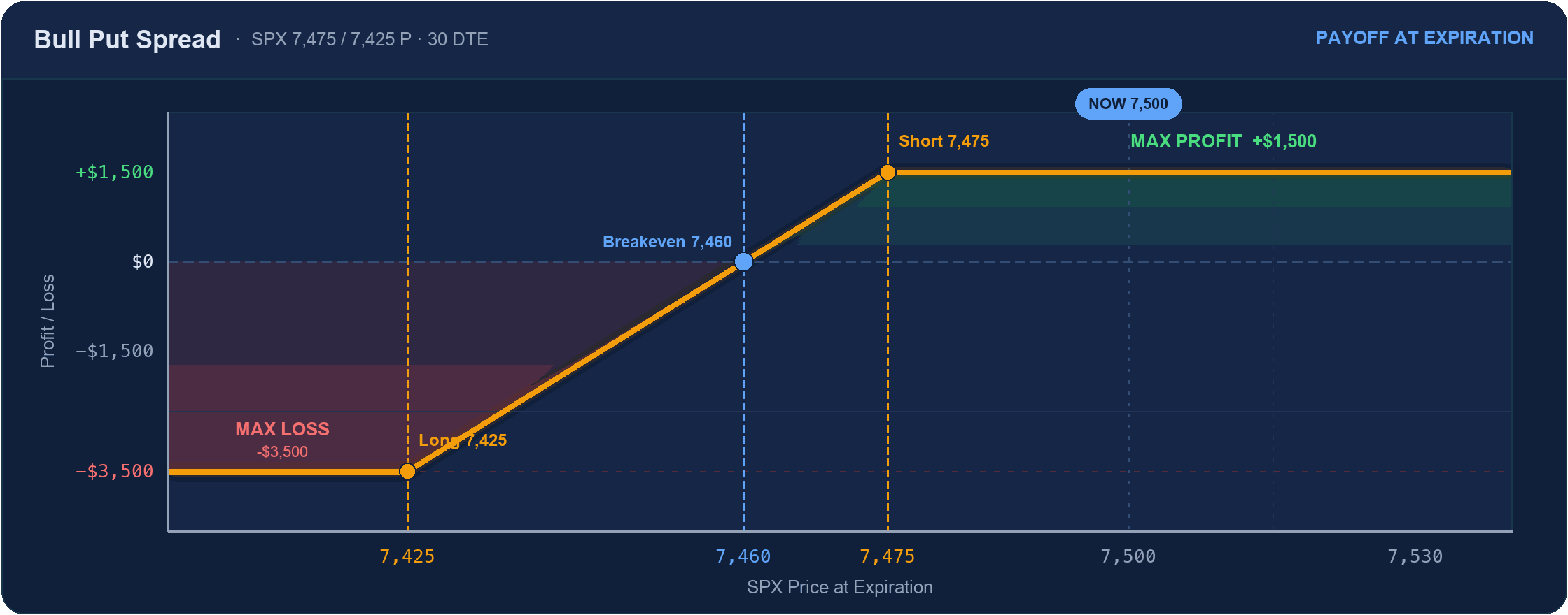
Max loss: −$3,500
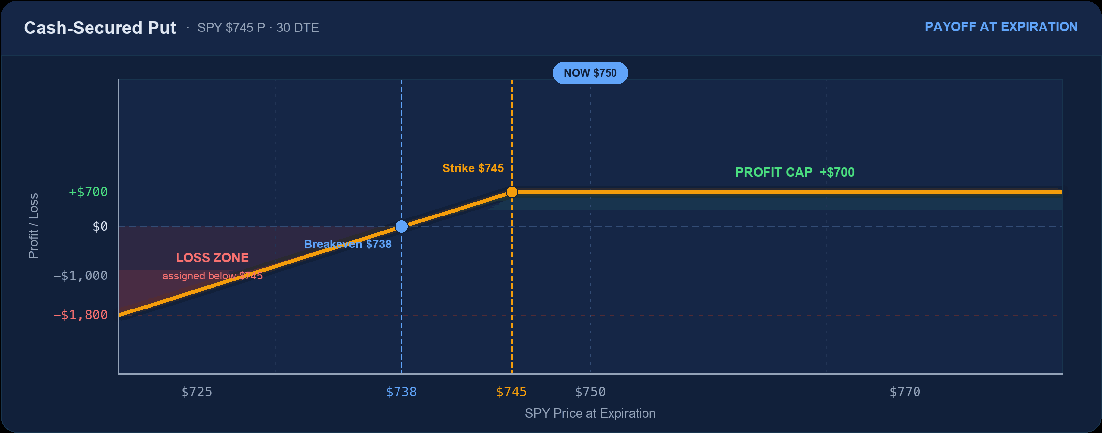
Max loss: Stock to zero
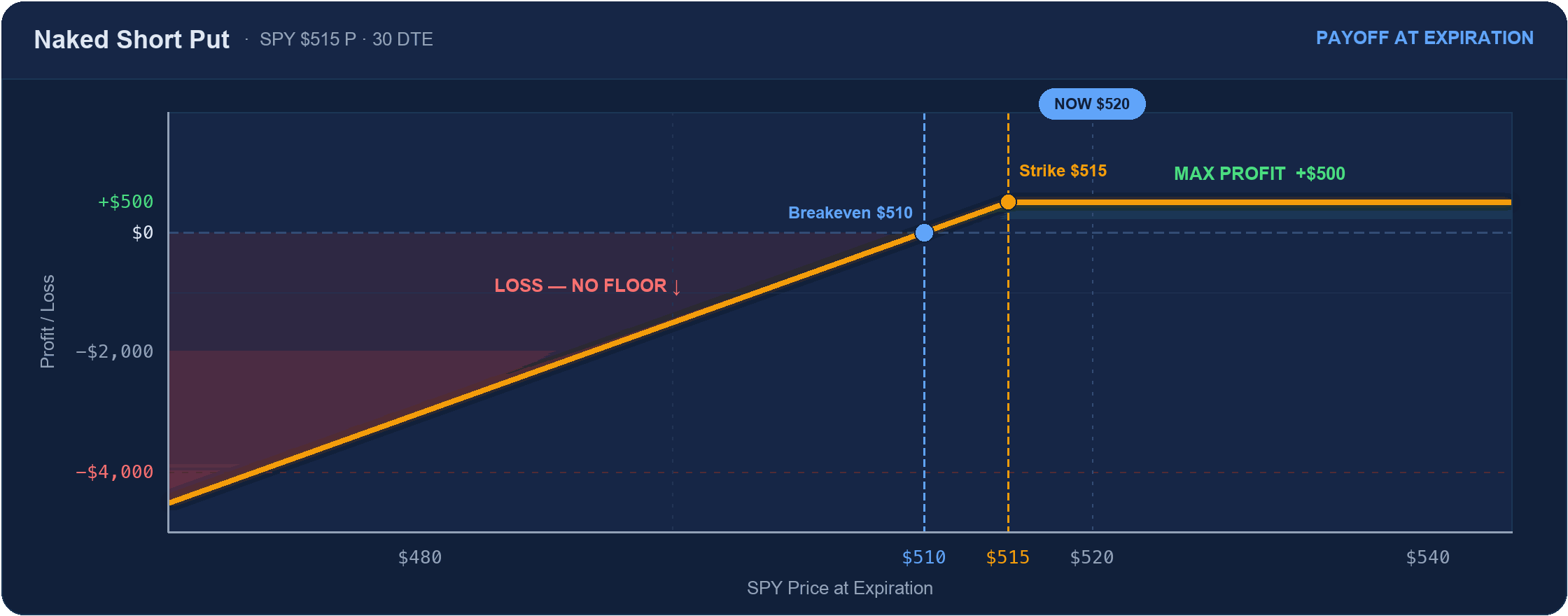
Max loss: (Strike × 100) − premium
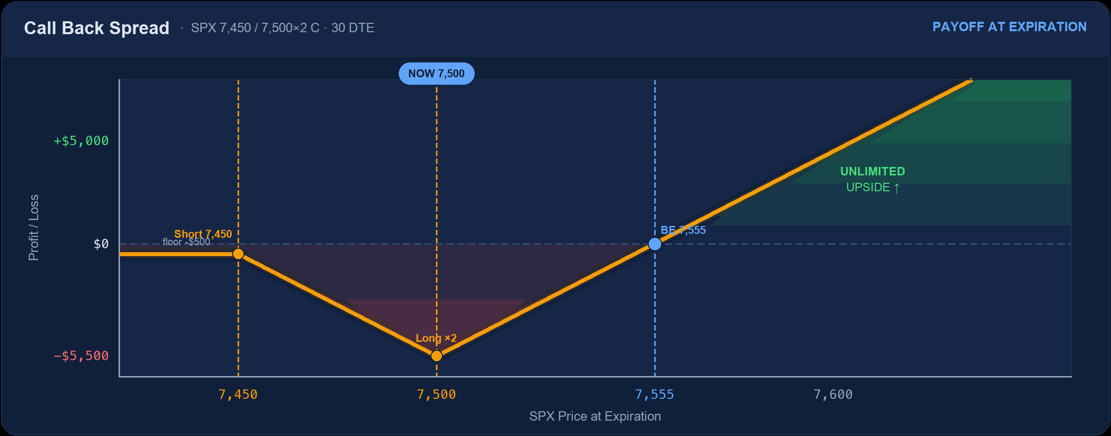
Max loss: −$5,500 at the long strike
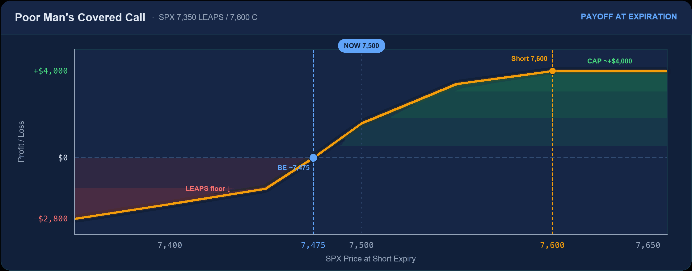
Max loss: The LEAPS debit
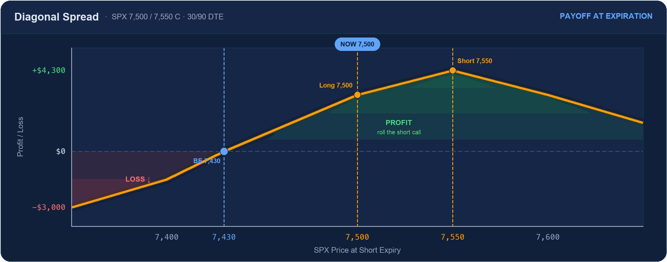
Max loss: The net debit
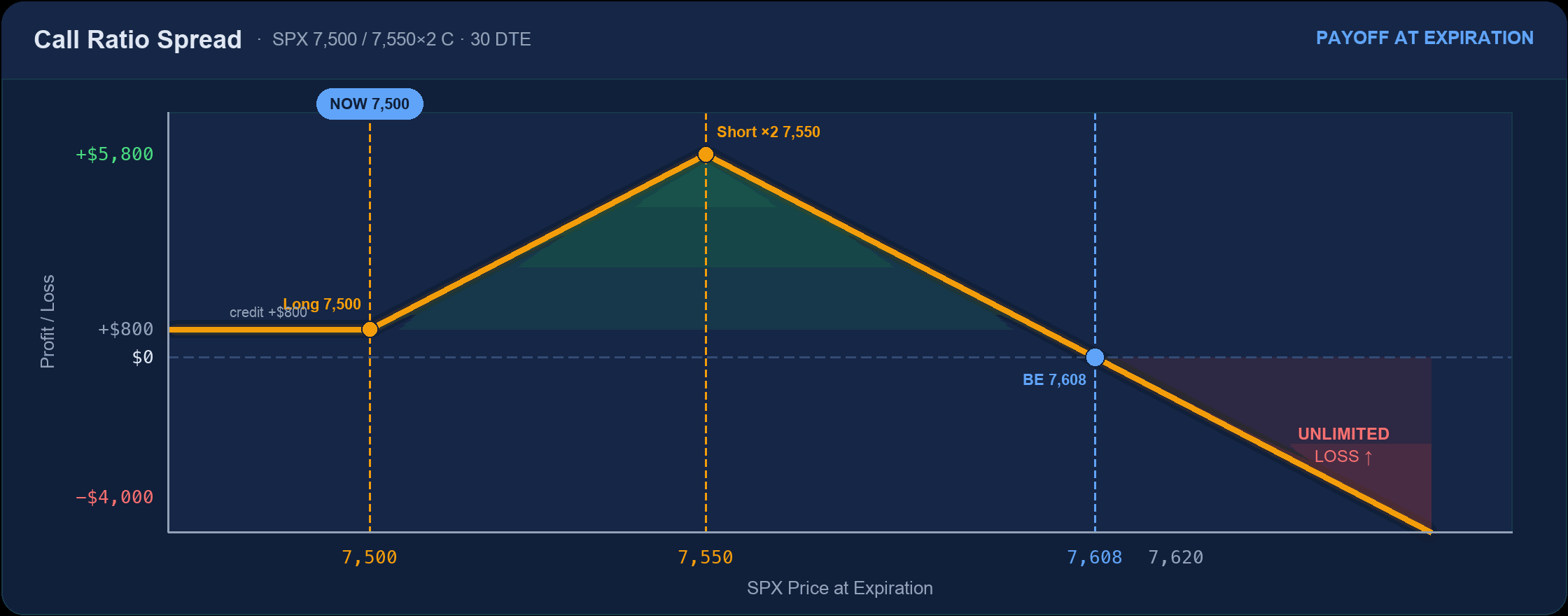
Max loss: Unlimited above 7,608
Bearish Strategies
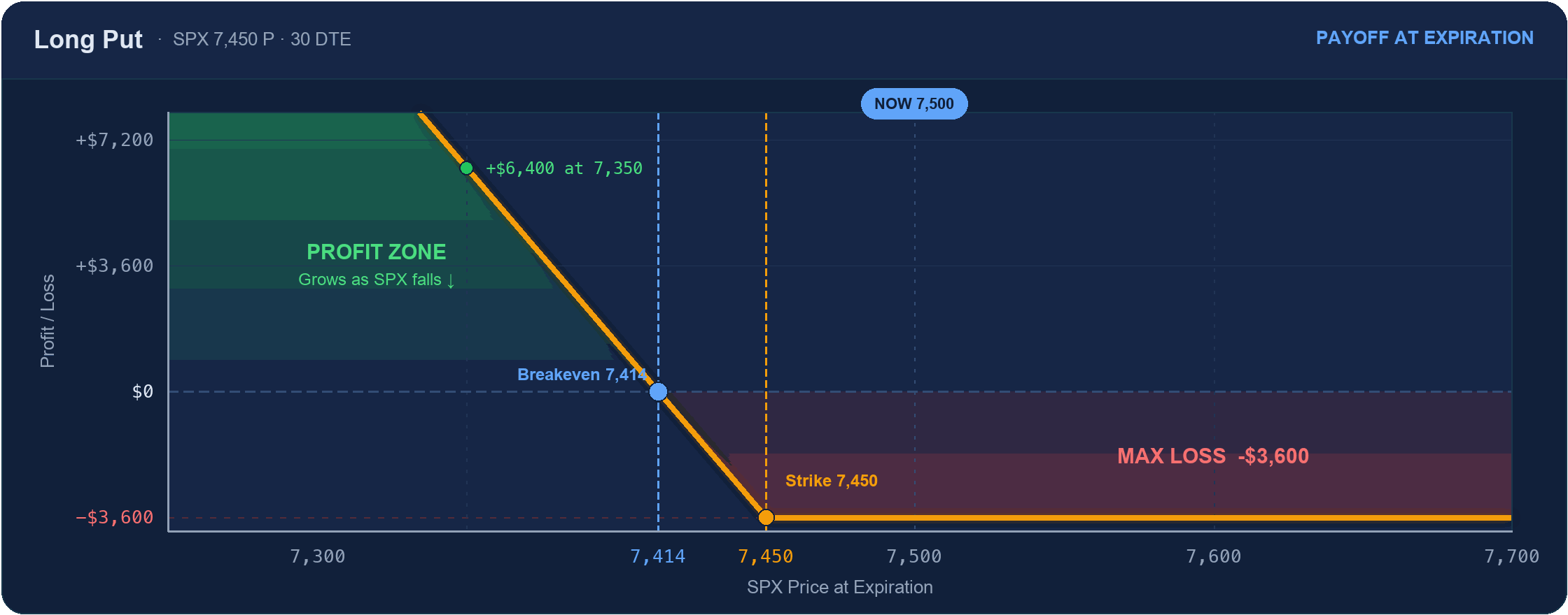
Max loss: Premium paid ($3,600)
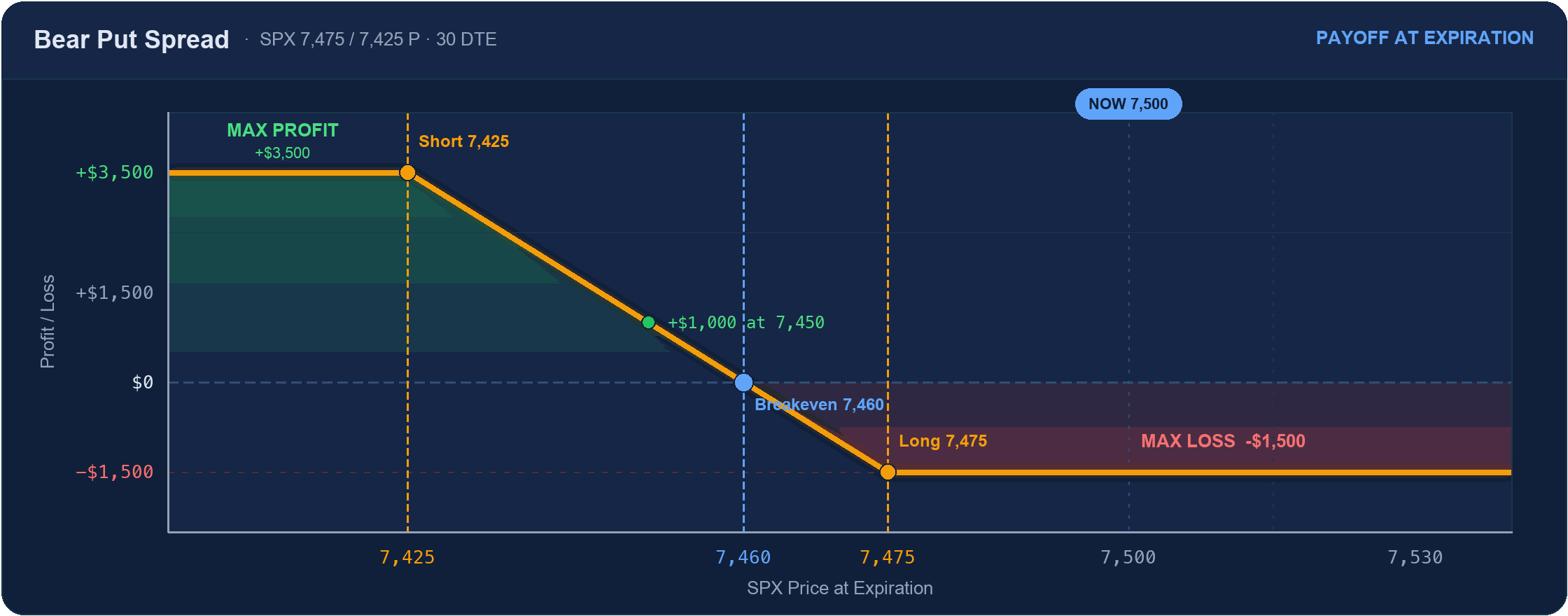
Max loss: −$1,500 (the debit)
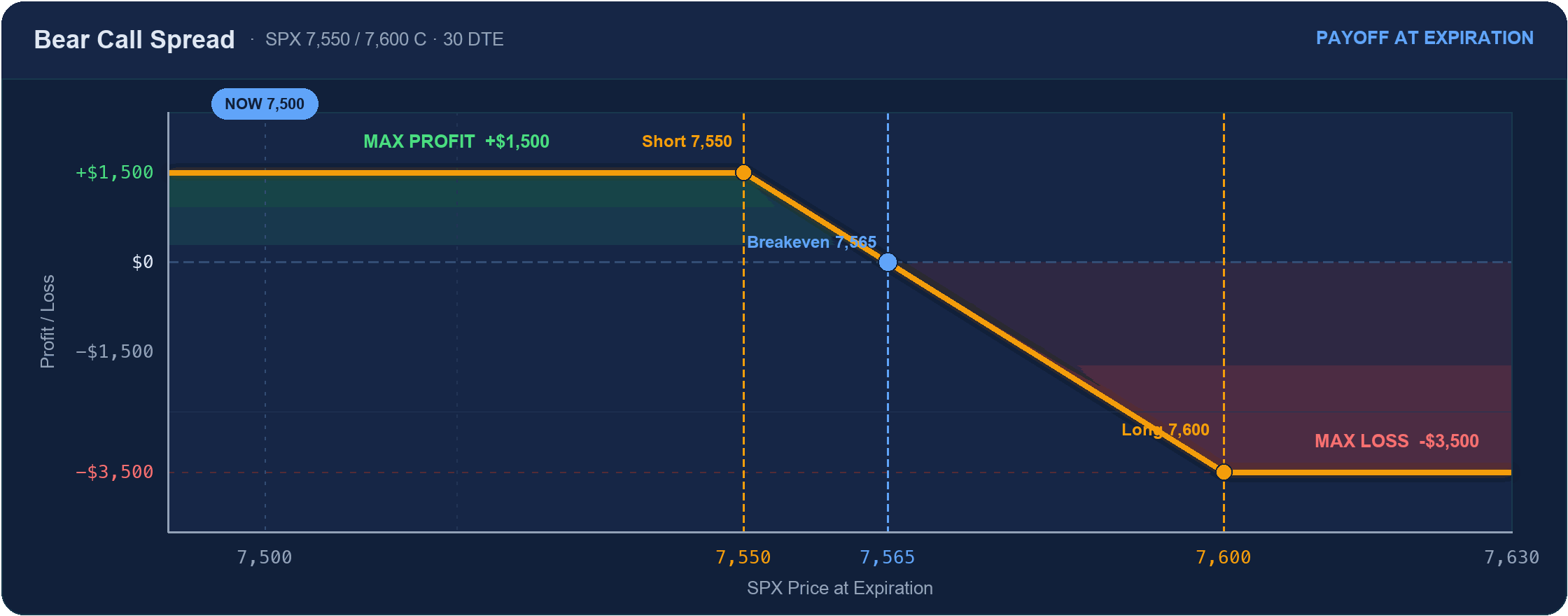
Max loss: −$3,500
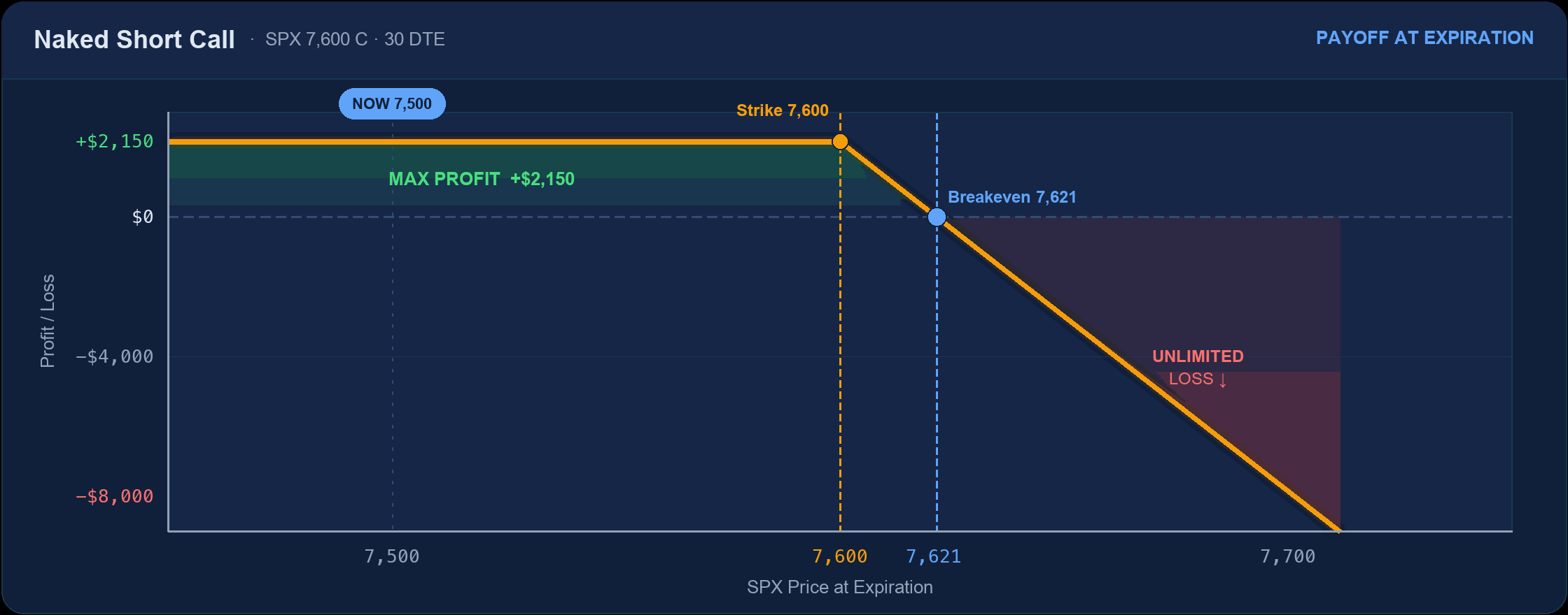
Max loss: Unlimited
Neutral & Range-Bound Strategies
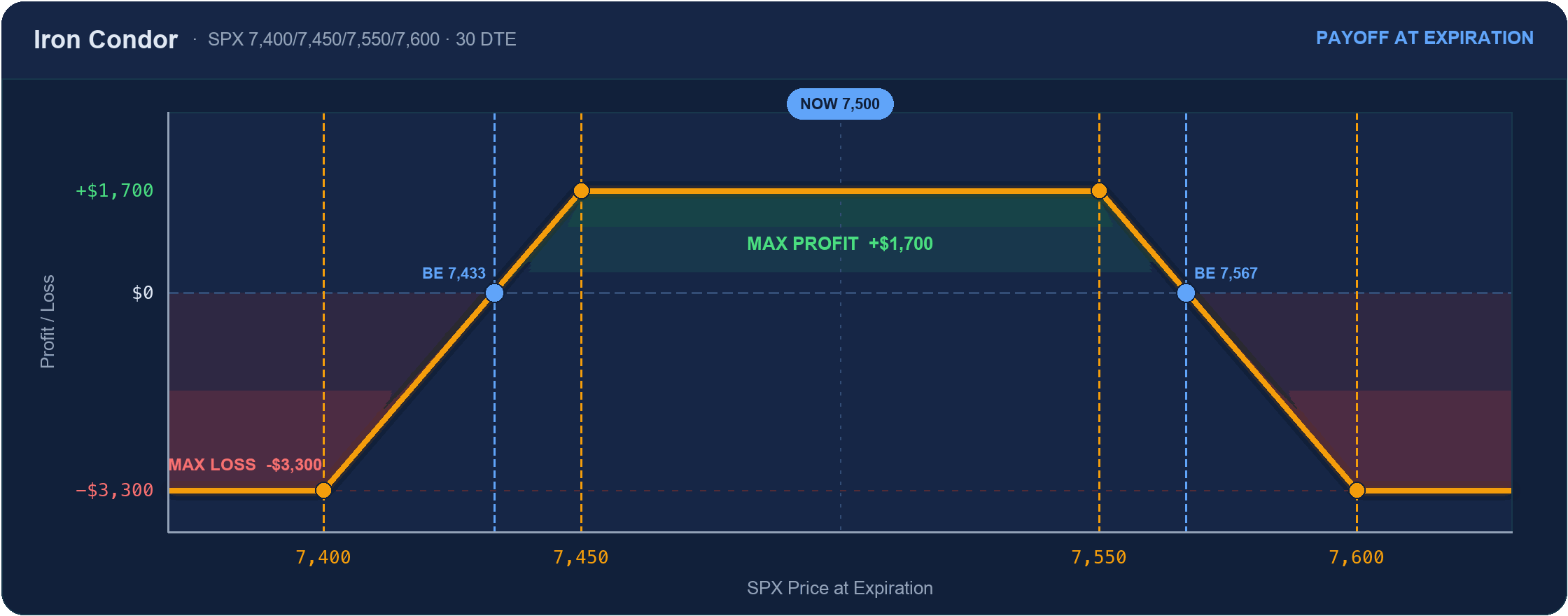
Max loss: −$3,300
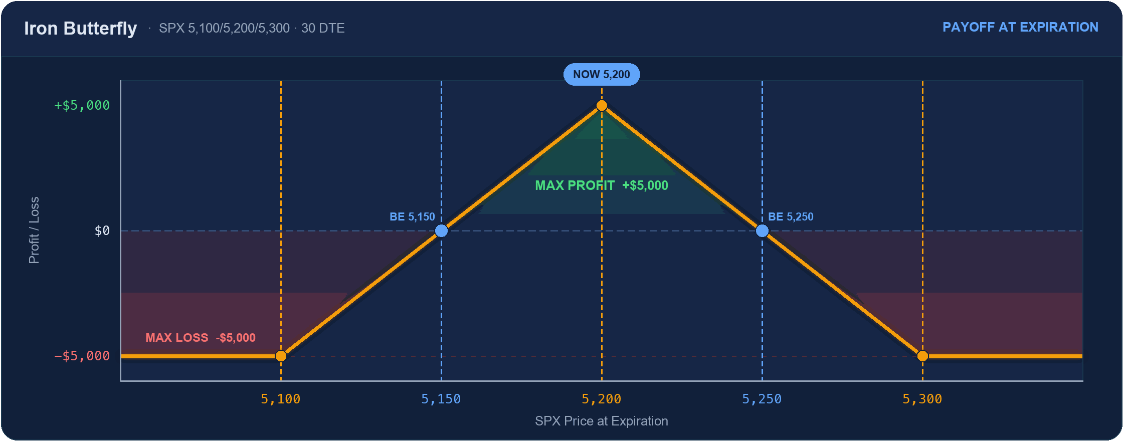
Max loss: −$5,000 past the wings
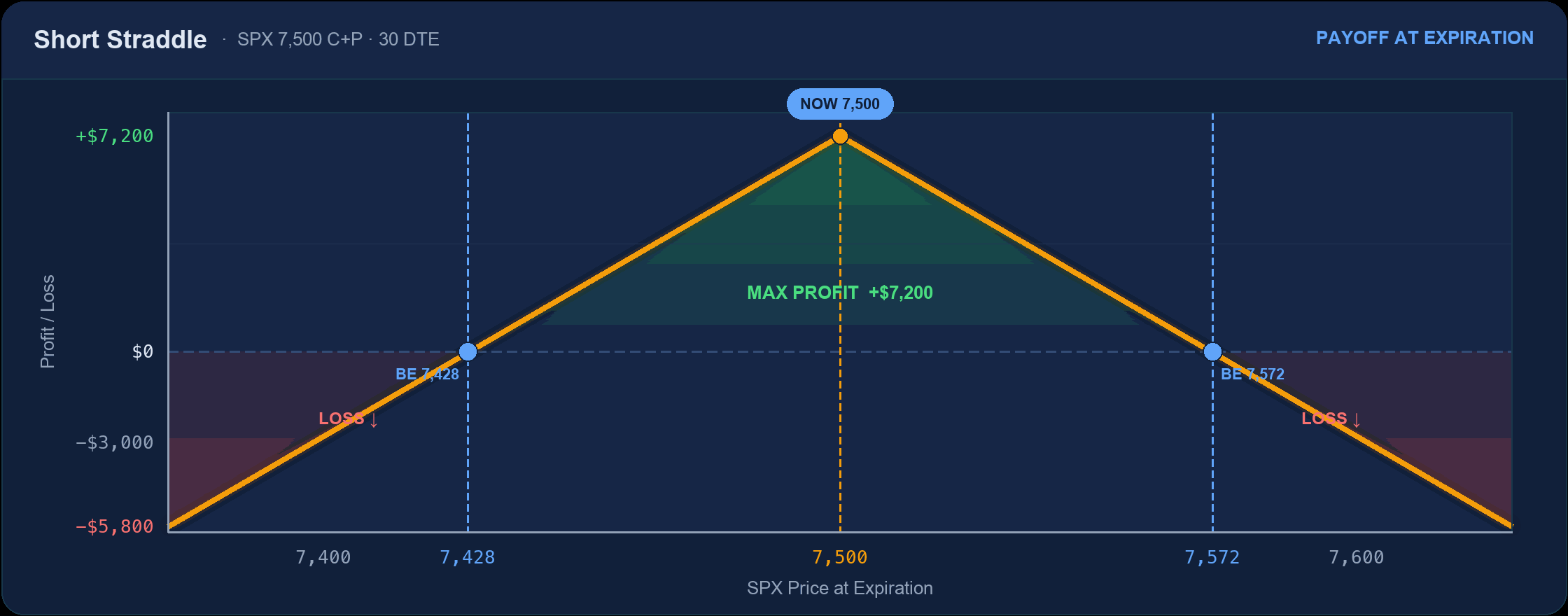
Max loss: Unlimited
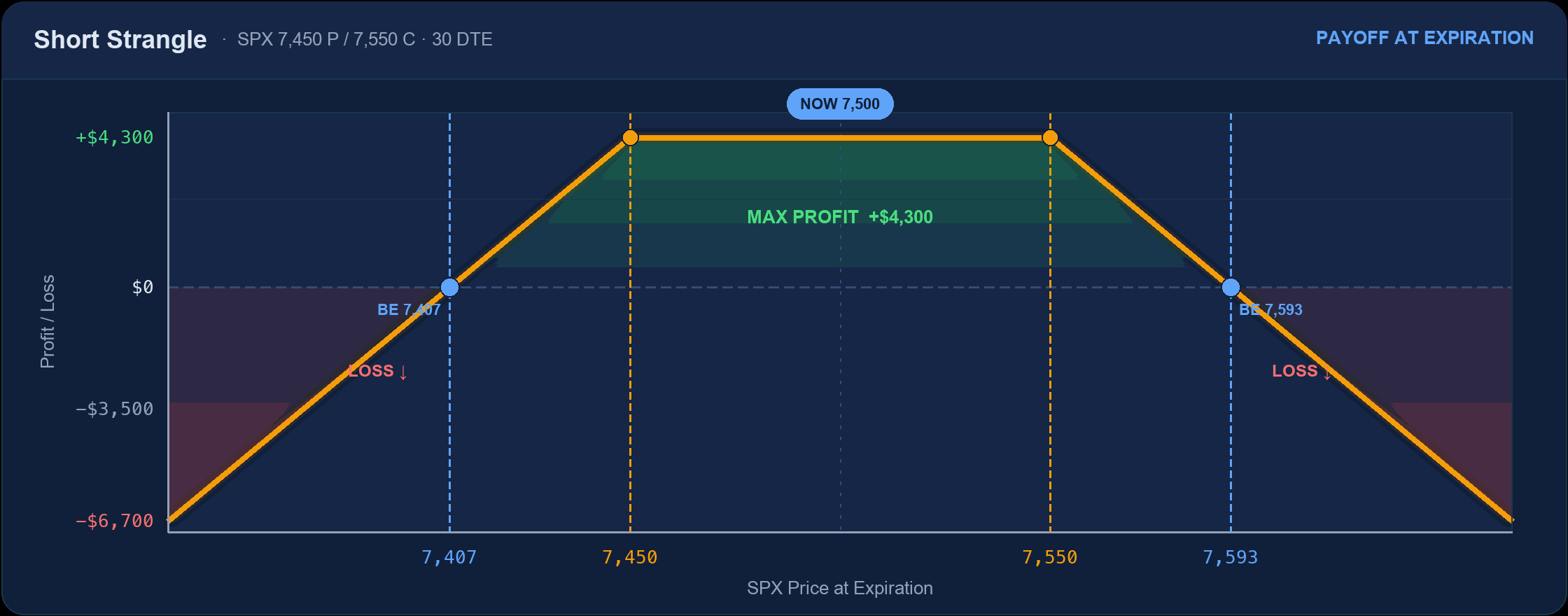
Max loss: Unlimited both sides
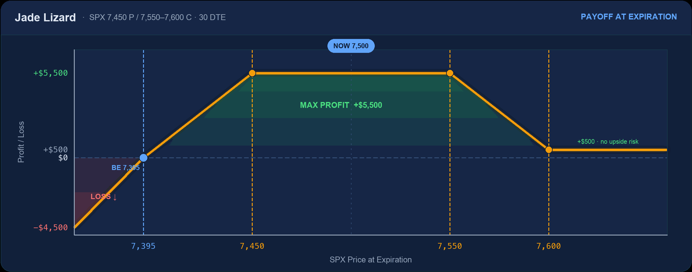
Max loss: Downside only, below 7,395
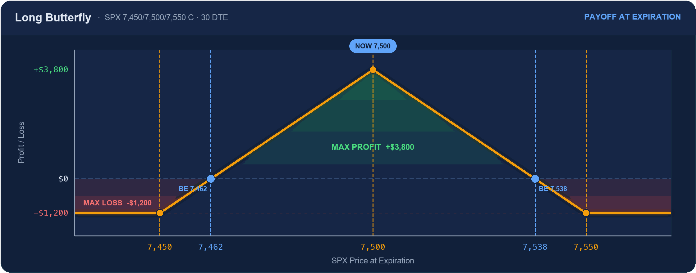
Max loss: −$1,200 (the debit)
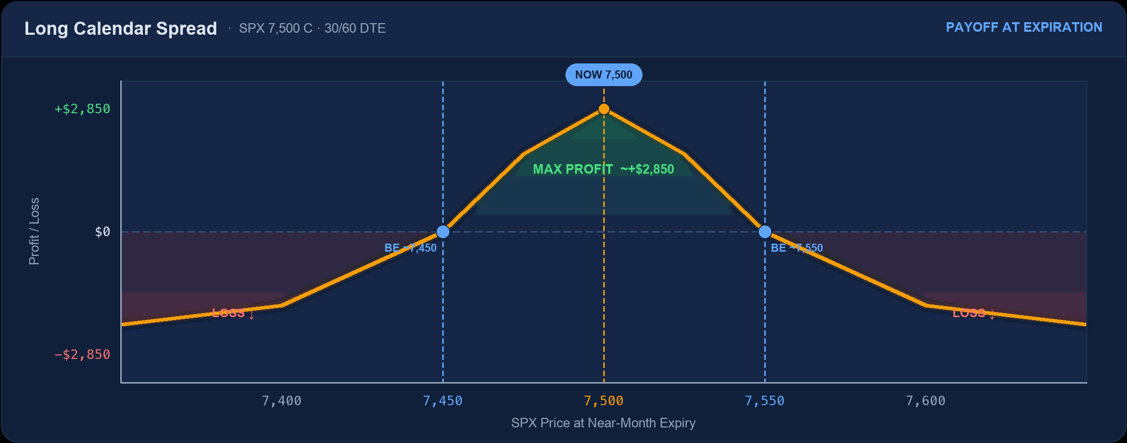
Max loss: The net debit
Big-Move & Long-Volatility Strategies
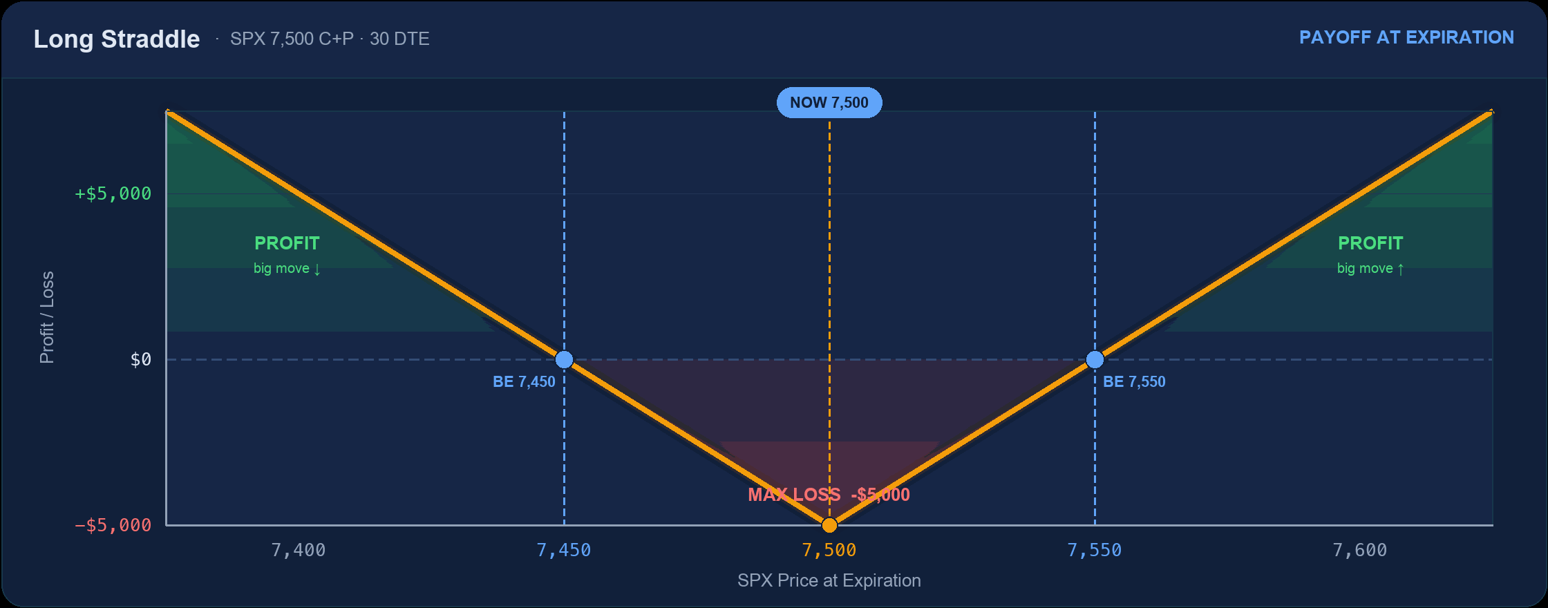
Max loss: −$5,000 at the strike
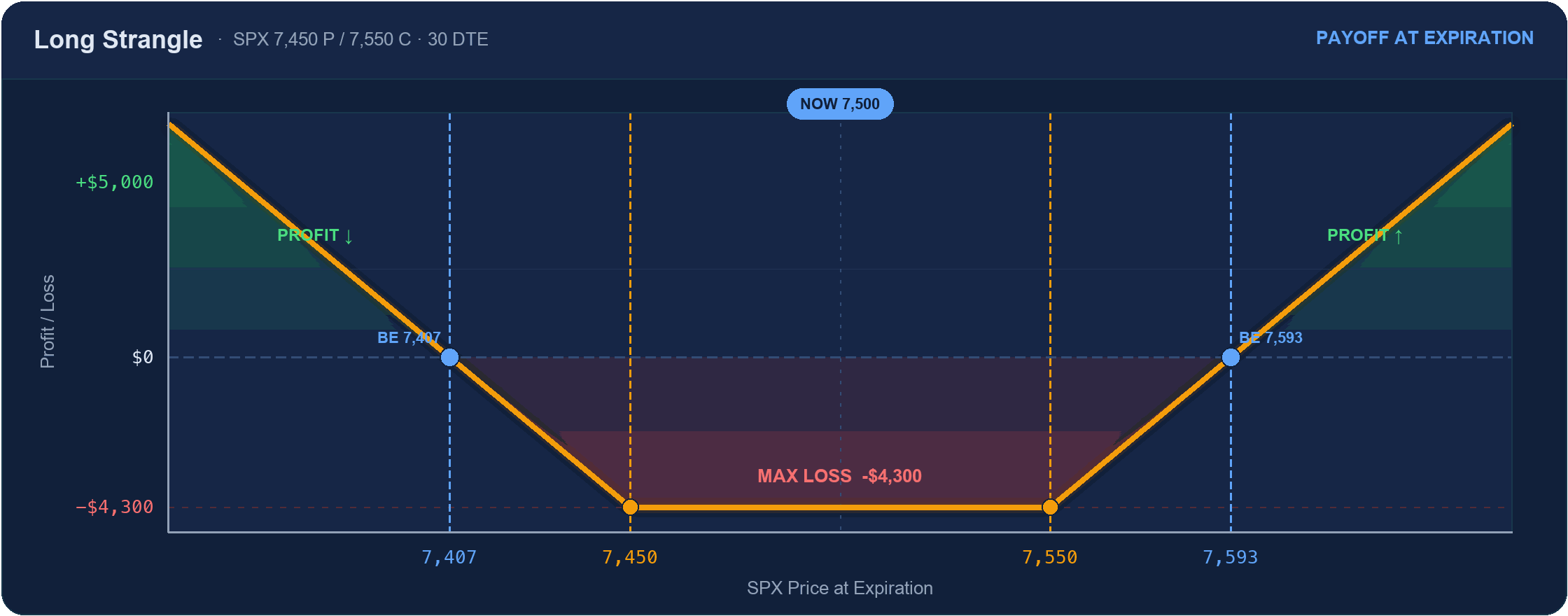
Max loss: −$4,300 between strikes
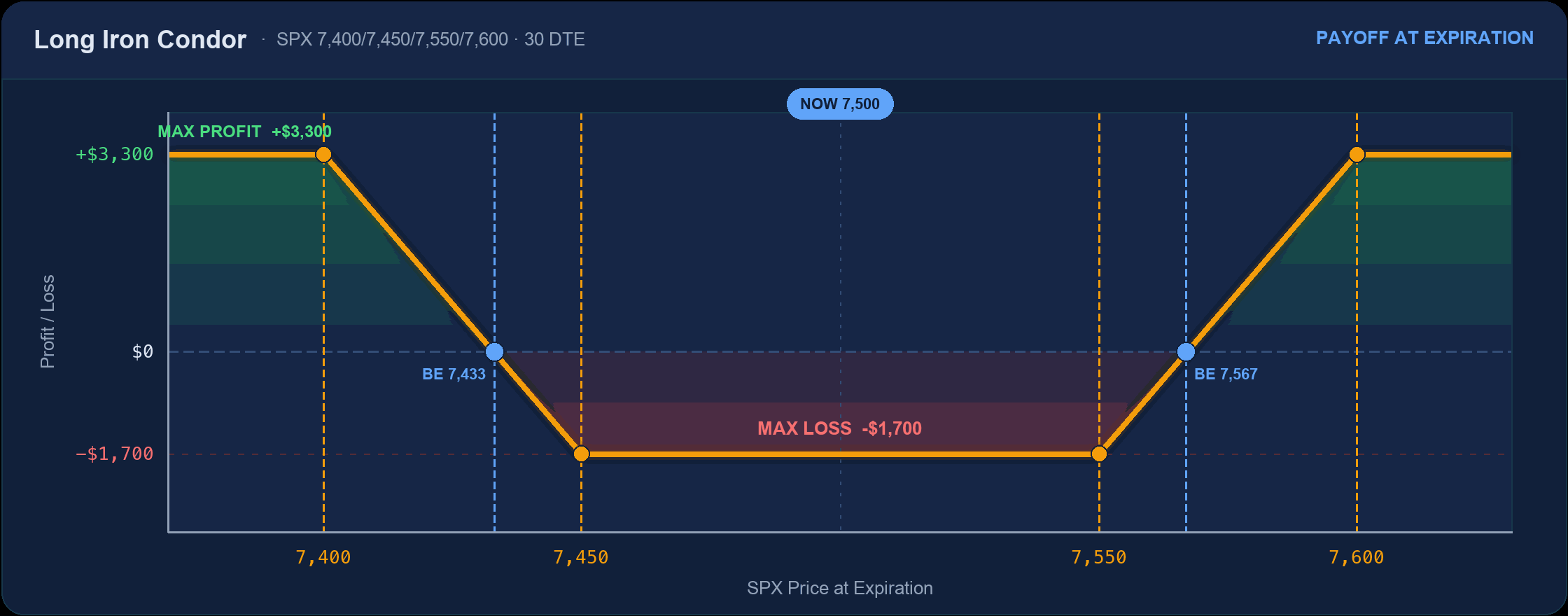
Max loss: −$1,700 (the debit)
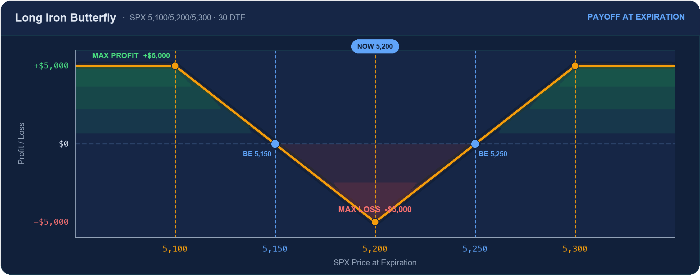
Max loss: −$5,000 at the body
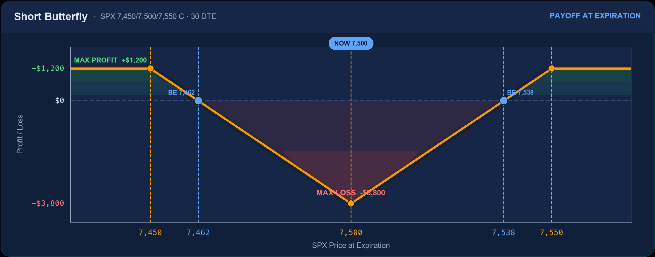
Max loss: −$3,800 at the body
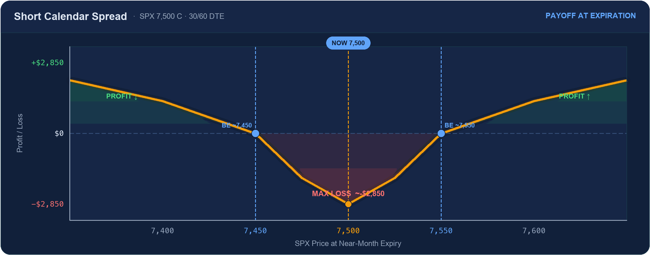
Max loss: ~−$2,850 at the strike
Hedges & Stock-Based Strategies
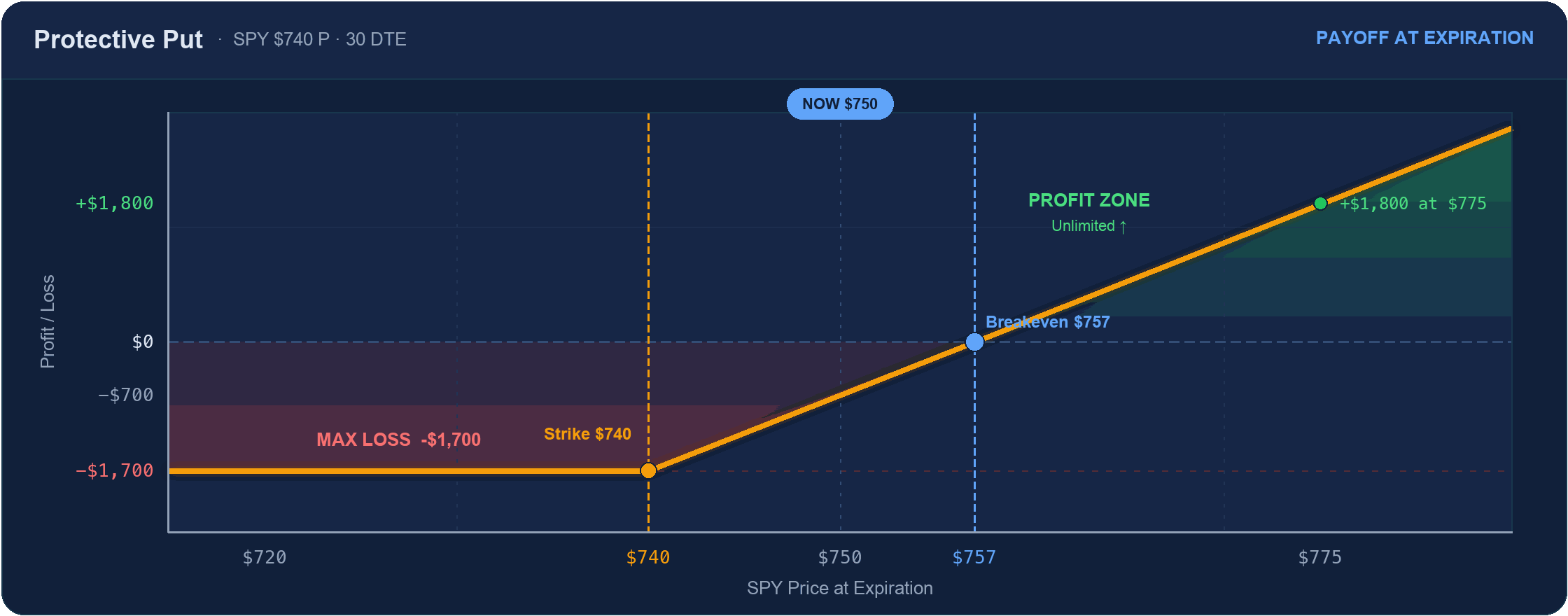
Max loss: −$1,700 floor
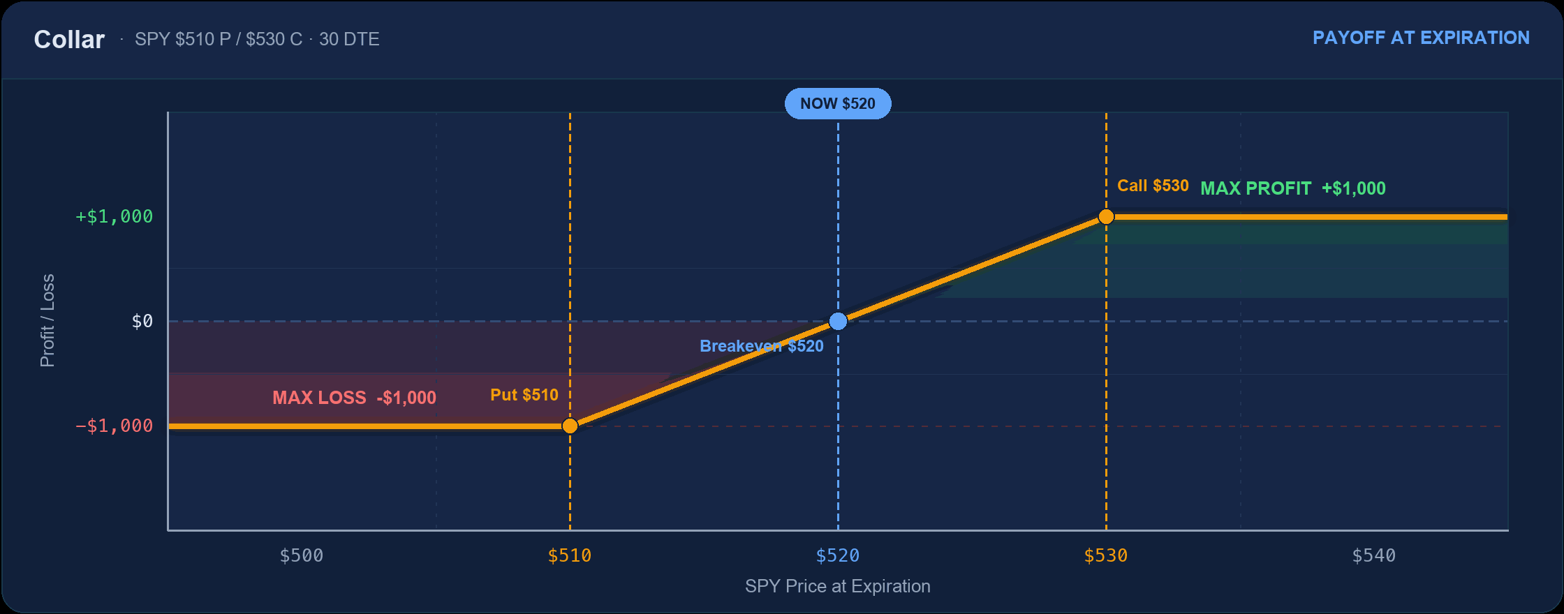
Max loss: −$1,000 (floored)
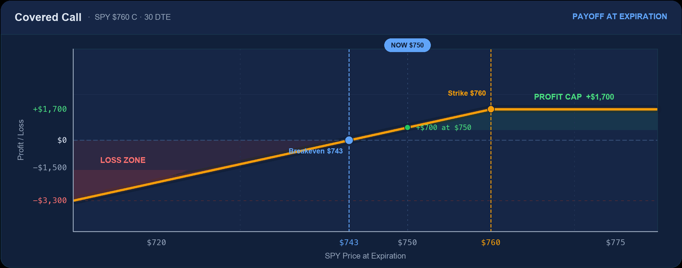
Max loss: Stock to zero, less premium
The Five Shapes Everything Else Is Built From
Thirty diagrams look like thirty ideas. They’re closer to five, recombined:
| Shape | What it means | Examples |
|---|---|---|
| Hockey stick | One capped side, one open side | Long call, long put, naked short call |
| Tent | Peak profit at a center strike, falling both ways | Iron butterfly, long butterfly |
| Plateau | Flat max profit across a range, falling outside it | Iron condor, short strangle |
| Valley | Worst outcome in the middle, better at the edges | Long straddle, short butterfly, long iron condor |
| Floor-and-ceiling | Both ends capped | Collar, vertical spreads |
Notice that every “tent” has an inverted twin that is somebody’s “valley.” A short iron butterfly and a long iron butterfly are the same four strikes viewed from opposite sides of the trade — one seller, one buyer, one chart flipped. That symmetry is the clearest argument that options are a transfer, not a machine: your max profit is the other side’s max loss, to the dollar.
Which Shape Do Premium Sellers Want?
The plateau. A seller’s ideal diagram is flat and positive across the widest possible range of outcomes, sloping down only where the market is unlikely to go — that’s the iron condor , the short strangle , and the credit spreads. The trade is deliberately unglamorous: a modest, capped gain that happens most of the time, against a larger loss that happens occasionally.
Buyers want the opposite shape. A valley or a hockey stick — small, known cost most days, in exchange for the rare session that pays multiples. Both sides can be right over a long enough sample; they’re simply being paid in different distributions. What the diagrams make impossible to hide is the trade-off. There is no shape with a wide flat profit and no downside anywhere, and every structure that looks like one has the risk hidden off the edge of the chart.
Frequently Asked Questions
What is a payoff diagram in options?
A payoff diagram is a chart of a position’s profit or loss at expiration, plotted against the underlying’s price. The horizontal axis is the underlying price, the vertical axis is dollars gained or lost, and the shape of the line encodes the strategy’s max profit, max loss, and breakeven points in one picture.
How do you read an options payoff chart?
Find where the line crosses zero — those are the breakevens. Flat segments are capped outcomes (max profit or max loss). Bends occur at strike prices. If either end of the line keeps rising or falling off the chart, that side of the position has unlimited risk or unlimited profit.
Do payoff diagrams show the position before expiration?
No. A standard payoff diagram is the expiration value only. Before expiry, a position sits above or below its expiration line because extrinsic value is still priced in. That gap is exactly what theta decay closes, which is why a short position converges toward its payoff diagram as the final hours pass.
Why do payoff diagrams bend at strike prices?
Because that’s where an option’s behavior changes. Below its strike a call contributes nothing to the payoff; above it, the call gains a dollar for every dollar the underlying rises. That switch produces a kink. One kink per strike, which is why a four-leg iron condor has four of them.
Related Articles
- Options Max Loss & Max Profit: Formulas by Strategy — the same thirty strategies as arithmetic instead of pictures, with the breakeven formula for each.
- Options Strategies Library — the full library organized by difficulty, from long call through jade lizard.
- Theta (Θ) — Time Decay — why a position doesn’t sit on its payoff diagram until the last day, and what closes the gap.
- 0DTE Iron Condor on SPX — the plateau shape applied to a single trading session, with entry rules and risk management.
This content is for educational purposes only. Options trading involves significant risk of loss. Always trade within your risk tolerance.